Build On-Brand Social Media Graphics at Scale (Without the AI Vibe Shift)
Build On-Brand Social Media Graphics at Scale (Without the AI Vibe Shift) So let’s be honest: the question isn’t how to create that one really cool...
Build On-Brand Social Media Graphics at Scale (Without the AI Vibe Shift)
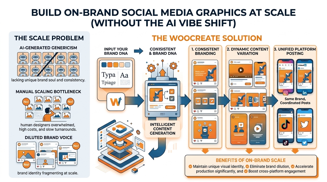
So let’s be honest: the question isn’t how to create that one really cool, on-brand social media graphic (since that should actually be the easy part!). The trick is building out a process for repeating this on Tuesday, and next month, and during your loudest week of the year in a cross-platform, on-brand way, while still holding fast to all your identity guidelines AND maintaining consistent levels across topics…and making sure the whole thing doesn’t kind of morph into an identity vibe shift AI pocket tomorrow.
This sticking point really shows how most small businesses see 'on-brand' as an aesthetic. In reality, what 'on-brand' represents for me is a repeatable production system: clear inputs, guidelines defining a visual system, a way to create iteration around those principles, and a lightweight quality gate to transform a fresh batch of renders into what I can publish. I have seen many brands speed their ascent not because their assets were the most visually appealing, but rather because they were producing at scale identical enough for their clients to recognize in the field. (If you want to go deeper on automation as a repeatable system, see social media automation.)
Here, you are going to translate your brand so that it can reliably and quickly produce at scale, especially once you bring AI into the mix. You’ll create guardrails around the design work to preserve brand consistency, establish a base format and prompted structure approach that works across themes, and equip yourself with a simple review process to make sure all visuals stick to the visual identity rather than feeling like they were created by someone other than your designer every 7 days.
Clarify what “on-brand” looks like (in AI-readable language)
Clarify what “on-brand” looks like, and make sure you do so in language an AI model could easily digest and recognize.
On-brand does not refer to your logo located in the corner of your visual frame or two hexadecimal color codes. It's a lot more than that.
It's a collection of non-negotiables that produces recognition even in new content.
It's the repetition of particular compositions (centered subject vs asymmetry, tight crop vs lots of negative space); typographic specifications (one headline style, one supporting style, strict hierarchy); contrast levels (bright and punchy vs muted and airy); spacing (dense vs roomy); the photo or illustration style (lens feel, grain, line weight), as well as overall energy (serious, playful, minimal, editorial).
If you define these you can start to identify your top results for the perfect outcome of social platforms. Research also points to the role of image recall: the 2024 arXiv paper on how image memorability can boost social virality provides empirical findings that more memorable images become more viral (quantitative study; see paper for measured effects).
Instead, however, take these rules and figures that describe exactly how you write and illustrate, report and critique visually, and eye out the brand framework and be able to do this consistently using AI or not.
To fix a messy AI vibe, rewrite identity in style terms you can define and control.
Write yourself a mini style dictionary that you tweak only rarely: short, crisp adjectives or code-like tags.
Then add a short rules handout, your do’s and don’ts along with contradictory bad examples you learn from.
I am going to say my personal example brand = clean editorial photography, high contrast imagery, lots of negative space, warm neutrals, a single bold/pivot of focus.
Let me throw you the DO NOT include: busy photos, low contrast pastels, doodly icons, any time visitors can immediately detect my rule doesn’t help them isolate one company from the pack.
This is why most businesses I work with have the first win I look for on a project.
Fewer versions is the result of fewer assumption-gaps between ourselves.
Less impact on your customers over the next month, your feed doesn’t change that much, and if it does, you start to look like 5 distinct brands instead of one. A benchmark to support why this matters is Marq’s brand consistency report landing page, which describes a survey of 400+ organizations.
Create a “gravity” library of reference
Next: Create a “gravity” library of reference.
Include only the image kinds you approve of.
The minor tips, textures, lights, backgrounds, icon or illustration style, know that these are how the AI defaults when you let them.
At any time visualize repeatable concepts in your library that you can reference.
A specific shadow angle: a sensory texture layer: a rigorously distinct picture format (tight close-ups, for example): a background pattern that always sits at 10 to 15 percent opacity and so on.
You’re going to want a restricted set of options, not an infinite selection, because an infinite arrangement is likely to make for wild variations within an AI feed, along with second-guessing your choice after!
Create a variation system that scales without looking copy-pasted
Finally, create a variation system that lets you scale without looking copy-pasted.
Figure out what you can let roam free (subject, scene, props, framing, seasonality) versus what must remain a brand constant (your color palette, type scale hierarchy, contrast level, visual rhythm, and motif frequency).
I always stick to the 'generate what's safe, edit what's specific' rule: generate things that are hard to disqualify, such as your mood scenes and cutouts, while keeping anything that needs to stick to legal disclaimers 100% editable like your headlines, CTAs, labels, and solutions copy.
This is also why various tools (WoopSocial included) can help with the workflow: if you establish your brand rules once via the platform, then generate as many variations and installations of your designs with your style, color, and logo already applied, you can focus on selecting relevant scenes and themes without constantly laboring over the basics. If you want a planning layer that matches this approach, use an AI social media content planner.
Establish a fast, scalable, repetitive end to end generation workflow
Establish a fast, scalable, repetitive end to end generation workflow.
Stop generating off-brand social media posts from the start.
Make intake a single-page brief that defines the post goal, the audience intent, and the single message the image must communicate.
This isn’t even a matter of denying aesthetics.
This is acknowledging that landing on pretty images won’t trigger attention and/or engagement; irresistible.
Check, I like these briefs basic, one sentence for the promise, one sentence for who it is for, and one sentence for what you want them to do next.
You will, with one quick edit, stop generating 40 variations of the wrong idea.
Then, translate your prompt into a recipe you can make again and again like a template.
Every single prompt needs to be identical, in the exact same sequence:
- subject
- environment
- brand mood
- composition
- lighting
- constraints to protect the brand
To win, remember that constraints are for small businesses since they safeguard a model's creativity.
Explicitly leave room for text, don't use a large palette, and discourage clutter.
Then, inform the model of things you don't want using negative prompts: no cartoon icons, no busy backgrounds, no extraneous objects, no fake company logos, no off-brand hands, and no unpredictable alphanumeric symbols.
I use this approach because AI is prone to thinking up logos and brand details so convincingly, they seem accurate enough to use, and these moments are the things that sap brand consistency over the course of a month's content posting.
Then, run generation and selection like a speed test, not a beauty contest.
Your selection criteria should be optimized for actual social conditions: make it legible at small sizes, ensure it is simple enough for text overlay, and avoid engaging a micro-detail that doesn't survive mobile compression into dirt.
As a rule of thumb, if you shrunk it to a thumbnail and you don't recognize it within a second, the idea isn't idea caliber.
Also, I reject anything that forces the viewer to figure out what they are looking at, because confusion is a scroll-stopper in the wrong direction.
This is an area where focusing in on batching ideas can be more valuable in winning, because you now have time to generate multiple variations per idea in one session, A/B hooks, different crops, or emphasis, generating more candidates in one sitting rather than context switching to crank out one winning spin asset all day.
Last but not least, you should separate raw-generation output from brand-layout construction and move post-generation to ensure system scalability.
You should incorporate your post-layout and typography guidelines after every generation so you always deliver a consistent look that includes brand-logo positioning, spacing, headline hierarchy and so on, while also keeping variety by integrating distinct images and copy in each post.
For example, you should export finished posts from a consistent layout frame, plus a background-only version for future reuse.
You should also name your files as Date_Platform_Campaign_Concept_Version and later identify them according to quality by only allowing V-final into the publish folder after a lightweight approval check against your non-negotiables.
You should note that when using the inherent brand generator like WoopSocial you follow the same workflow with the difference that branding effort per every campaign gets decreased through reducing the manual steps of applying colors, logo, and style on every variation. If you also want to speed up the writing side while keeping consistency, an AI social media caption generator can help keep your post text aligned with your content system.
Find the plans of platforms you are using: specs, safe zones, topics for each platform
Find the plans of platforms you are using: specs, safe zones, topics for each platform.
To learn more on how to create on-brand images for social, you'll need to pick your formats first and not last.
Feed, story, short-form cover, and LinkedIn landscape, they are unique sizes that want different results.
For instance, a stretched-to-fit quality that the centered pic might call out on the IG feed can be misallocation on TikTok if the cover crop twists your interest, while eye-in-eye-size illustrates on a story can be too full when built in the grid-shape of a feed.
So either appoint the primary make-ups for each impromptu separately in the preparation or hope your artwork will live the afterlife image manipulations that needed to occur after delivery.
Think of the 'safe' areas of a frame like a strategy; don't let them constrain you.
The vast majority of content processing remains UI layer deposition, typography captions, etc.
Before you write a single API call, just start everything you need in a very positive space, a clean plane from where you can't erroneously add your overlay onto.
I advocate for the simplest image you can create, obviously instruct your model to produce one main focal element with one large bleeding margin, and leave it blank before committing to identity cohesion.
This is why I remain disciplined with my schema for keeping all novel brand elements incorporated via overlays, vector flattens, or combinations of any kinds and to just resolve any manner of AI theming elements?
Think of AI not as a full canvas in every standpoint but more like an undertone to highlight the theme, color, light tone, and texture sets that are form influencers for the commonality over collections.
If you utilize available DOF, positive border levels that prioritize label-design in priority, you will consistently recognize your campaign brand identity through abstraction, repetition, and gradually building accurate sizing over time.
You want to give yourself a lot more margin for error than you think the apps will afford.
Broadly speaking, you should make it as large as you can whenever you can, because this is one more crop opportunity down the track: In other words, you can make it tall for Stories/Reels, it can make it square for Instagram feed, landscape for LinkedIn, nobody loses their heads but you.
Just plan for compression snafus, removing out anti-band problems with the subtle treatments (continuous gradients run afoul with artifacts though the compression will have reduced tonality), small text will turn to illegible splat or crude squiggly lines; micro-compression may just quite happily blur the soul of the image entirely.
My measurement is that thumbnails can be readable, reduce the image to one tenth of size and decide: do I instantly know what it's about in less than a second?
If not, why would someone who doesn't know you scroll in the feed?
Then deliberately customize for each format; the requirements vary significantly across networks.
Standouts on Instagram thrive on clean visuals and a uniform feed, and leverage a clean scene and leave negative space for story-first viewers.
For TikTok and Reels cover images, emphasize high contrast with a clear, centered face or object, as it's often heavily cropped or displayed for short durations.
Because, for a start, use LinkedIn with credibility cues like editorial lighting, realistic contexts, and generous spacing that reads cleanly on mobile.
X, demand fast response, thus bold shapes, minimal text, and a strong silhouette outperform intricate visuals.
If you use WoopSocial, I treat it as the guardrail that keeps overlays consistent across these exports, while the generated image stays the adaptable scene underneath. If you’re systemizing this across weeks, a social media content calendar can help keep the workflow predictable.
Brand guardrails for AI outputs: high quality control without slowing down
Brand guardrails for AI outputs: high quality control without slowing down.
Here are the essential steps to take if you want to be able to build branded social images at scale: implement a quality gate that takes a few minutes, not meetings.
Write a fast-run on-brand line to your quality gate so nothing goes out of the door until it first meets these four consistency benchmarks, color palettes, text styles and hierarchy, logo usage, and composition/spacing for spaced feeds (and vibes don't be too heavy anymore, just clicky and above 'a thousand impressions in feed is fine forever').
For small businesses especially, this thumbnail won't do it since many social networks never make more than thumbnails … (or literally reduce drafts by ~10% or so and they cannot make the subject and their mood jump to them in less than a sec … get infinite check on these thoughts today!)
AI makes predictable mistakes, meaning you can set guardrails once and then ride that wave as fast as you’d like.
Top of the list is off-brand typography, which is exactly why you shouldn’t let AI handle final text.
Use the AI model as a background and scene generator, then apply your own fonts and hierarchy in the layout stage.
For invented logos or product details, you’re keeping such inaccurate brand attributes out of any visual generation, restricting things the model “can” depict (no text, no logos, no packaging labels, if it matters).
Finally, a trend of a recurring cast of characters or visual throughout a series lacks consistency so try providing reference images to “anchor” the model and tighter prompt constraints.
I’ve seen consistency soar when I slow my prompting horse down to grind out a fixed subject, keeping ~70-80% of the prompt structure unaltered when just tweaking things like the actual subject.
The concern that most people do not anticipate is meaning, or unintended symbolism and imagery that end up conveying the wrong message about your brand, particularly if you distribute broadly.
View it as a cursory security step, and, when playing the long game, ask a friend to “check the room” with you for implications regarding tone, class signaling, or semantic images to make sure a picture is spiritually aligned to the character values of your brand; without this conciliatory stakeholder stewardship, a vibrant but ill-fitting social media post will regress your “living probability component” in a radical outcome quicker than a peak hover or poorly optimized platform pick.
To keep the tempo at a given volume, you're better off being able to chop through a small number of approved styles as opposed to all the eternal peregrinations.
Choose two to four style lanes that you can defend, identify and replicate, and produce within those lanes such that any new deliverable ends up looking like it were generated from one system.
When you do want automation, I'll use WoopSocial as my able governance switch that can automatically place brand colors, logos, and style guidance during the order, minimizing the amount of brand choices that you must make with every updated UI post while still allowing you to cross-scale on the line a minor observation or submessage in any given brand filled asset idea. Marq’s brand consistency PDF report notes that 25.7% noted that brand consistency substantially contributed to overall revenue growth, and 37.4% reported that brand consistency modestly contributed to overall revenue growth.
Our priority is to maintain an accurate, consistent pipeline, not endlessly recreate more and more high-quality specifics.
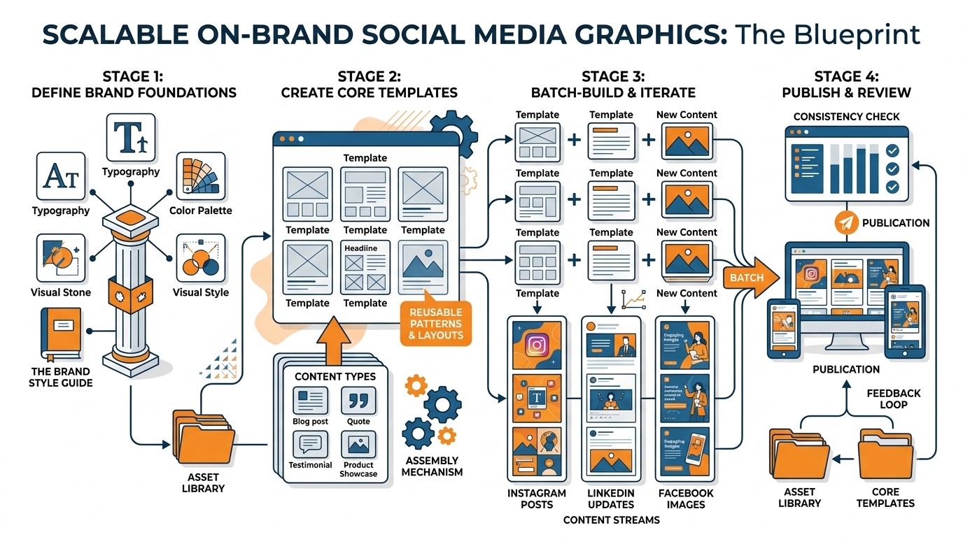
Consistently producing on-brand social images does not involve attempting to create one perfect post every time. You'll need to create a system that you can run weekly to make this your reality.
You do this by clearly defining brand guidelines that you then convert into a prompt structure that barely changes. Then, define processes to ensure that the actions carried out in generative AI are always distinctly different from a branded layout.
This is the game-changing element: Generative AI works great for creating mood, scenes, textures, and simple focal points. A thematic brand identity system is for typography, spacing, logo placement, and hierarchy. When done correctly, this can provide consistency to your imagery even as topics, seasons, and campaigns change fast.
Get your pipeline platform-specific early, not at the end.
Think strategically about how feeds actually work: audiences mostly see your work as a small shot on a thumbnail; platforms resize photos so, micro-details and thin type die instantly.
Using a strong specific economic guidance rule, make sure whatever you’re making will be feasible to reduce to 1/10th of a size: if the sample gets that small, and if you can’t identify the subject and message in under one second, it is not ready, no matter how pretty it is.
Build your base imagery with intentional negative space, generate at a size that can be cropped into multiple formats, and only then apply your consistent layout frame.
Add a QA shortcut that stops drift, because yes, drift is really the problem with recognition.
In a couple of minutes you can scan for palette consistency, type hierarchy, logo treatments and contextual space.
But the check that virtually every SME overlooks is this one last thing: make sense?
Are there inadvertent symbols in the work that don't fit, are the mismatched lifestyle cues wrong, or do the tone signals that contradict what you sell conflict with your user perception?
I have watched brands lose trust not from low quality visuals, but from inconsistent cues that make the audience feel like a different company showed up today than yesterday.
So once you have your system, scale is the boring and good thing to deal with.
You have way more volume, but it always looks like you.
You can take this exact same pipeline.
You can actually have the brand panel take your colors, your logo, your aesthetic styles, and all of that stuff automatically; or you can do it yourself.
So you just have it stuck in this, again, very carefully constructed style within guardrails.
On WoopSocial it comes with brand-aware generator options, which takes all your styles, your colors, and your identity, and injects them into all the posts to create a massive amount of post-ready files, so that you have it done and still consistent in terms of your brand identity. If you’re building this into a larger workflow, Wistia’s 2023 video marketing report shows that 15M videos were uploaded to Wistia in 2022 (as shown in the report page chart), and their companion breakdown, a summary of key insights and benchmarks, notes its State of Video Report includes benchmarks by industry and data on optimal video lengths for social (report summary page).
Related reads
4/27/2026
B2B SaaS social media benchmarks: Set the right targets.
B2B SaaS social media benchmarks: Set the right targets. The trouble with defining B2B SaaS social media benchmarks is that it's an inherently impe...
4/25/2026
Building a personal brand as a technical founder (without becoming a creator)
Building a personal brand as a technical founder (without becoming a creator) Creating a personal brand as a tech founder should feel less about ma...
4/20/2026
Creative Post Ideas for Sustainable Brands (That Don’t Sound Greenwashy)
Creative Post Ideas for Sustainable Brands (That Don’t Sound Greenwashy) That’s not what creative post ideas for sustainable brands should look lik...